MOBILIS Mobile Accessories
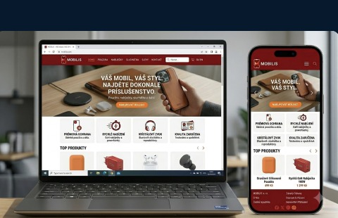
MOBILIS is a bold, fully responsive e-shop for mobile accessories where strong product categories and a modern color scheme create an instantly recognisable shopping experience.
Project story
MOBILIS came to us with a wide catalogue of mobile accessories that needed a clear, modern e-commerce home instead of a cluttered marketplace listing.
The site was designed on React and TypeScript with a bold, product-first layout — big category tiles, clean product cards and a checkout flow tuned for phones.
The color scheme was chosen to look modern and self-confident while still keeping products in the visual center, so nothing distracts the customer from the item they are shopping for.
The category system was structured around the way people really shop for accessories — by device, by function and by style — with filters that stay simple on mobile.
Performance, image optimisation and responsive layout were the top priorities so the shop feels instant even on slower mobile connections.
Project summary
MOBILIS shows how a large accessory catalogue can feel simple, modern and premium when built on the right structure and design system.
The e-shop combines bold categories, clean product cards and a fast mobile experience into one coherent platform.
The result is an online store that is easy to expand with new products and campaigns while keeping its strong visual identity.